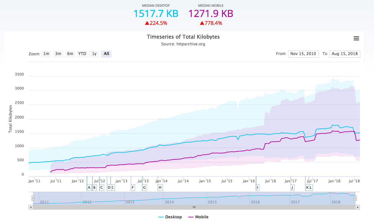
 Text and numbers are all good and well, but sometimes it’s nice to just be presented with a nice visual.
This post is full of videos of just that, interesting visualizations of data. Being the geeks we are, they’re of course all related to the Web and the Internet.
Enjoy!
The work done by a web server
Someone put this great video together using the website access log visualizer Logstalgia. You can see visitors to the left and the server to the right.
More website traffic
Once again, a high-traffic website access log visualization, this time using another tool, Gource (which we’ll show more from later).
Website traffic… bubbles?
Interesting website access log visualization using glTail. Each circle is an HTTP request, and the size of the circle shows the size of the request.
24 hours of traffic to the New York Times website
A pretty cool visualization, mapping the location of the site’s visitors as the hours change.
Web traffic meets genetics
Here’s another interesting visualization, creating an “organism” based on the access pattern to a website. Doubly geeky, then…
11 seconds of Twitter
A brief look at Twitter’s firehose anno 2009.
Tag clouds on Twitter
One more Twitter visualization, this time showing tag clouds bubbling up in realtime.
Location, location, location!
Location streams from Foursquare, Gowalla, Twitter, etc, during SXSW in Austin, Texas this year. Created using Processing and OpenStreetMap.
The global activity on Facebook
While we’re on the subject of social networks, why not have look at the activity on Facebook? This is a pretty interesting visualization, showing different kinds of Facebook activities mapped onto a model of the planet.
The development history of Apache
Apache is the most widely-used web server on the Internet. This is a visualization of its development history using a tool called Code Swarm.
The development history of Linux
Another fundamental part of the Web today is Linux, highly popular in web servers. Here’s the code swarm showing it’s development from the start (1991) until 2008. Note the vast difference in activity over time. At the start, there’s just Linus Torvalds, but just look at the activity during the later part of the video.
Linux, the last 5 years
Because it’s just plain pretty, we couldn’t help but include one more visualization of the Linux kernel development, this time using Gource.
The development history of various open source projects
We’ve already mentioned Gource (which is, as we’re sure you’ve figured out, a software version control visualization tool). Here’s another cool video showing projects like Drupal, Ruby on Rails, PostgreSQL, etc.
DNS… stuff…
Not entirely sure what’s being shown here other than that it’s DNS-related. Again, using glTail.
A network with 300 peers
Another visualization tool strutting its stuff, this time SkyRails, showing activity in a network with 300 nodes.
How the Internet has grown
As a relaxing ending to this little collection, we thought it would be nice with a visualization of what’s making most of this possible: the Internet. This is a slideshow, but it’s worth looking through.
We hope you enjoyed these videos. And for those of you in the United States, happy Thanksgiving!
